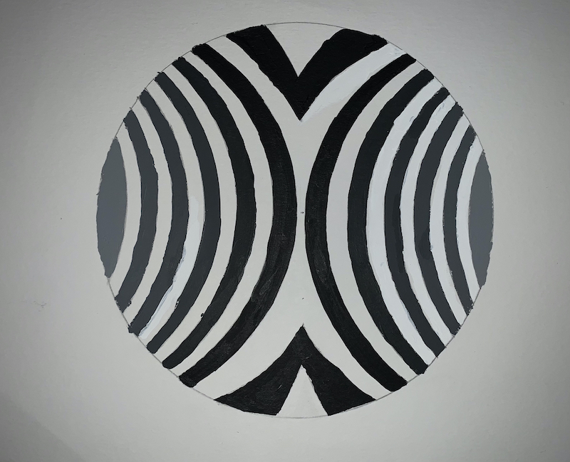
Good design but I think the white spaces could have varied in value as well. The one light gray value on the left seems isolated. Brush work could use improvement, sometimes you need to simply wet your brush to get the paint to flow better. Perhaps if you photograph your work in better lighting we could see more of the subtle shifts. Overall you did good work.
Good design but I think the white spaces could have varied in value as well. The one light gray value on the left seems isolated. Brush work could use improvement, sometimes you need to simply wet your brush to get the paint to flow better. Perhaps if you photograph your work in better lighting we could see more of the subtle shifts. Overall you did good work.