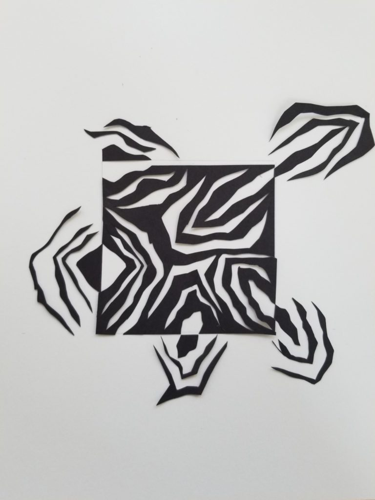
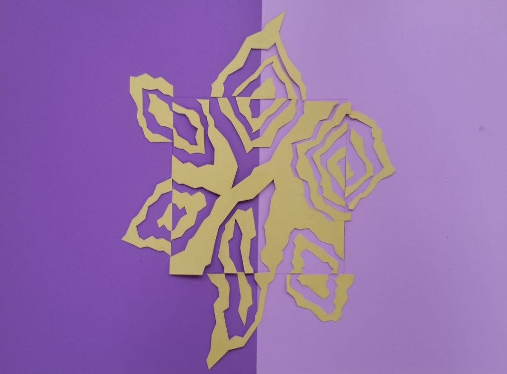
Your Notan designs improved from Black and White to Color in both composition and expansion of the square. In the B/W design the square is dominant. The color design is more integrated and has complementary contrast but not simultaneous contrast, you would need more bold color saturation for that effect.
Did you ever glue it down the color pieces? Please repost.
I just reposted the color one!