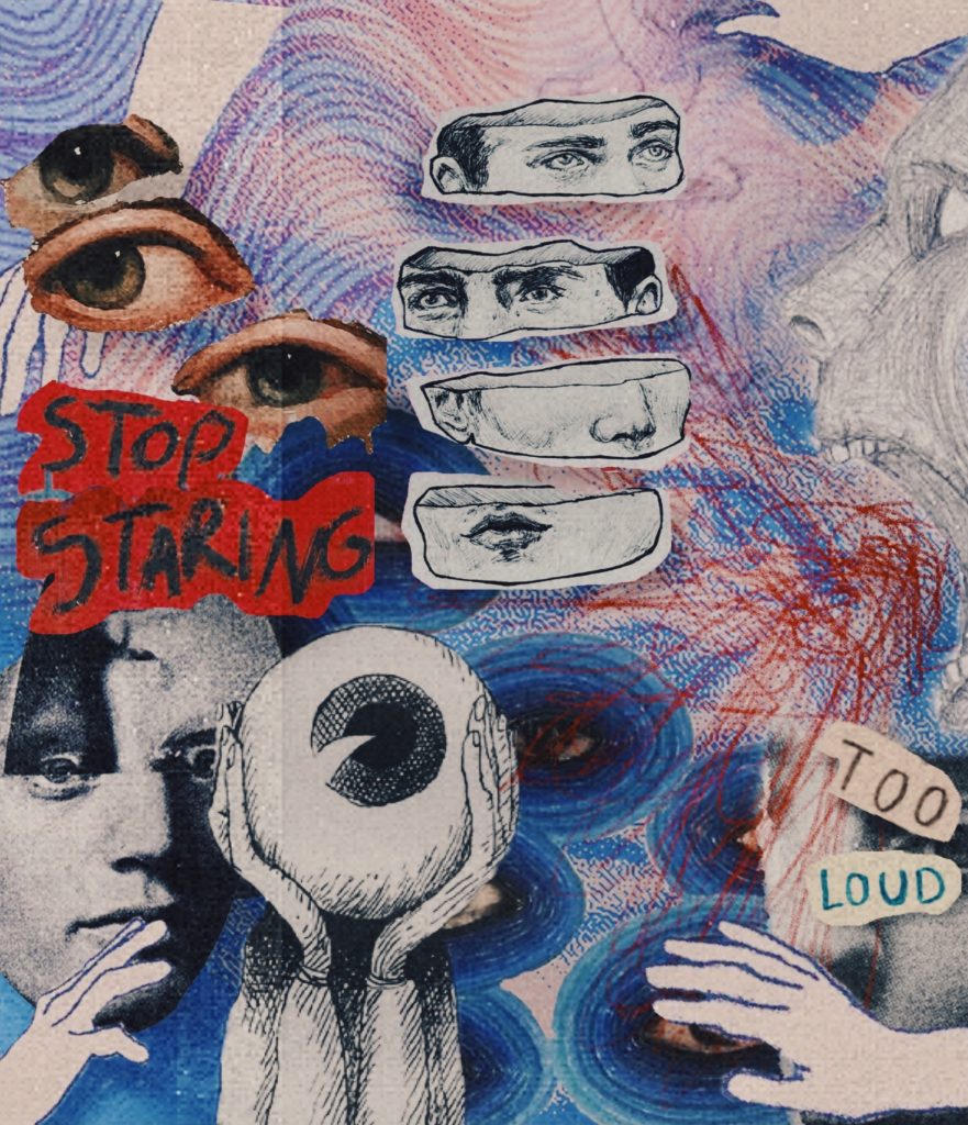
App used: Bazart
5 Elements of Design:
- Color: The colors I used were mostly blues, red, white, gray, and black. I added a but of saturation to the photo to make the colors blend and pop. I also used a film and turned up the opacity to give the photo a filmy look.
- Emphasis: I would say there is no certain element that is the true center of the photo, because all of the elements are supposed to catch the eye. When you look at the collage more, you can focus on a different part of the picture. There are also accents in the back that are eye catching as well.
- Unity: There are different layers to the photo, but I tried to tie each part together by matching the colors and adding shadows to each part of the picture to add depth.
- Proportion/Scale: I did not use a proportion or scale for this collage. I wanted it to be messy and unorganized because it fits the aesthetic of the collage. I placed each image where I thought it would be placed best.
- Texture: I added the film texture, and I also added a bit of grain. Also the images used in the photo range from smooth edges to sharp corners, and I think the clash of the two textures makes it flow nicely.
I really respond to the hand drawn quality of your images and how you put them all together. You have a natural hand and eye with collage and I hope you will continue making them. I was also impressed with how you didn’t let the lack of access to the software to inhibit your design process and figured out how to make it work. Nice work!
Please do send me the name of the app that you used and also write your 5 Design Elements in bullet points with your collage.
Excellent! Thanks for your Design Elements. I will recommend Bazart app in the future too.