Elements of Design Used:
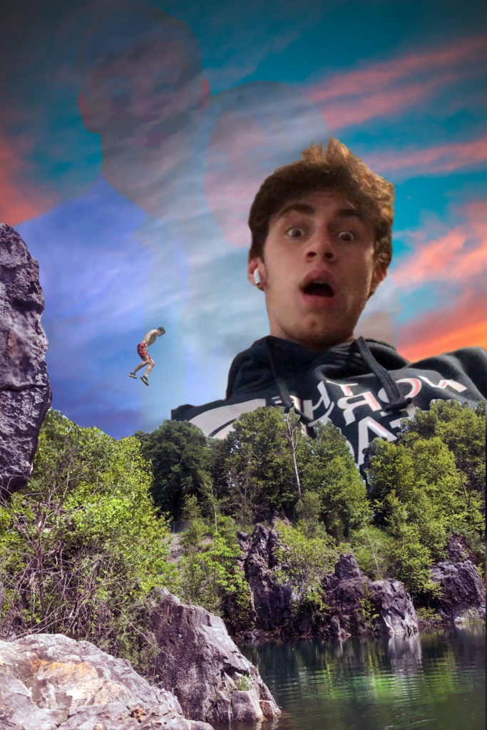
- Color – I adjusted the color of each layer/piece of the portrait to be cool, calm colors. I think that given the picture would have a very different feel if the colors were to warm and excited, maybe sending a message I didn’t want to send.
- Emphasis – Certain areas of the photo – the water, me jumping – were lightened in order to direct the eye more. I wanted these parts of the image to be noticed first, then have the rest of it unfold and give the portrait depth.
- Unity – As I said earlier, I wanted the portrait to have layers, but at the same time I wanted it to work together. By adjusting shadows, tone, color, and sizes I think I was able to make multiple images function together as one coherent image.
- Proportion/Scale – In my mind this was an important part of giving my portrait unity. As weird as it sounds for an obviously made up image, I do believe that there were correct sizes for each aspect of the image in order to give it “correct” Perspective. I think if I had done different scalings it would appear more as a series of images laid on top of each other.
- Texture – I didn’t want my portrait to have any “sharp corners.” I tried to keep things as soft as possible. The rocks which have the roughest texture were altered to look less jagged while still being rocks.
Dan, you did a great job on the Digital Collage and really took to the Photoshop process. I hope that you continue on to either minor or major in AAD. Congrats on a strong semester.
I hope to see you in a Painting class in the years to come at Lehigh!