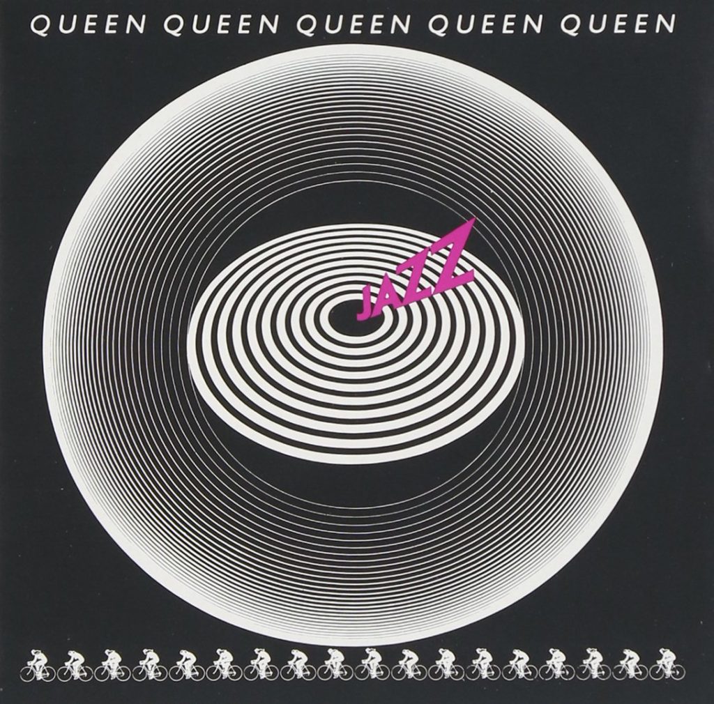
The first image is Queen’s Jazz album where I got the light gray, dark gray, and magenta colors for the background.
The second image was my starting image of Freddie Mercury in which I got rid of the background and turned his body into basically a silhouette.
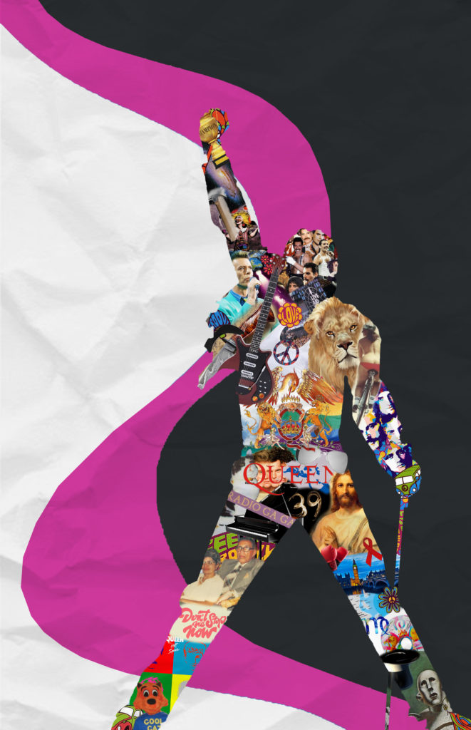
Third image is a progress shot where I filled up the silhouette entirely of images from the internet relating to Freddie Mercury, Queen the band, songs, and albums, and the time period itself.
And finally, the top image is the final design. I realize my piece is slightly busy and overwhelming but that is also what I was going for: to match Freddie Mercury’s expressive personality. Also, image quality was much better on photoshop than here. Thank you!
5 Elements of Design:
- Balance: the main collage aspect is centered slightly to the right with the words “Freddie Mercury” (which are in the font Queen is known for) balancing on the left.
- Texture: Silhouette collage of Freddie Mercury has a shadow aspect, along with a transparent wrinkled paper texture over the entire piece.
- Color Palette and Contrast: The colors chosen for the background (very light gray (almost white), magenta, and very dark gray (almost black)) were picked straight from Queen’s Jazz album. The silhouette has no strict color palette. However, there is some contrast as the background is mostly black/white and magenta which really brings out the yellows and other bright colors in the body.
- Movement: if you look at the magenta stroke, your eyes begin at his hand, then his head, then the text, then the bottom of the piece.
- Asymmetrical: While this piece is balanced, it is also asymmetrical. For instance, the left figure in the background is larger than the right and also begins lower. This was mostly done to fill up extra space.


Allie, Great job on your Queen poster design, the description of each design element are clearly evident. I too am a Freddie Mercury fan and can feel your enthusiasm through your design. Balancing the busy action of the Freddie collage with the calmness of black and white work well. You learned a good deal about digital collage and made a cohesive design. You used your time wisely and took advantage of the lab sessions which shows in the improvements in your design. Congrats on a well done semester!